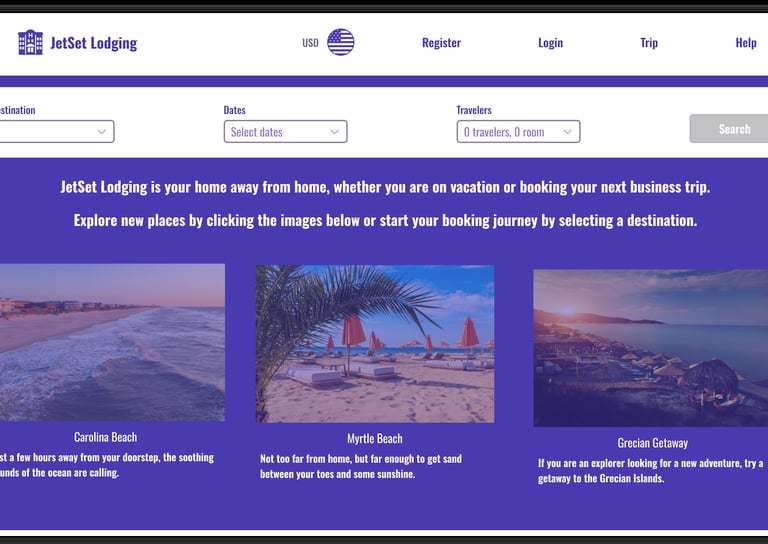
Projects
A selection of my recent UX/UI and marketing work.
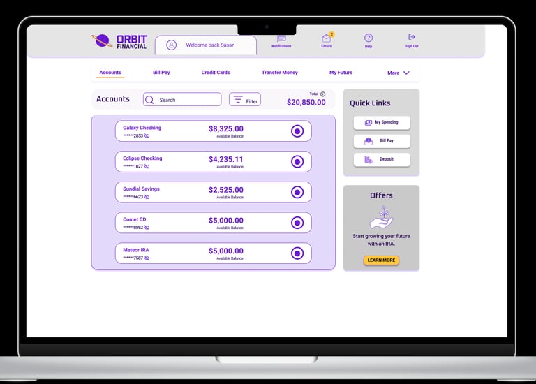
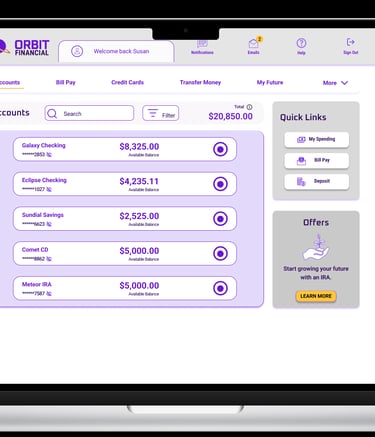
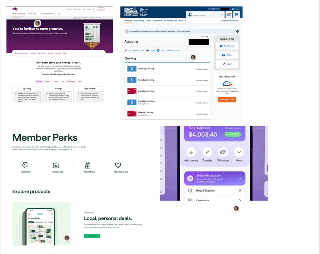
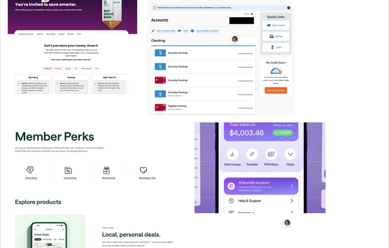
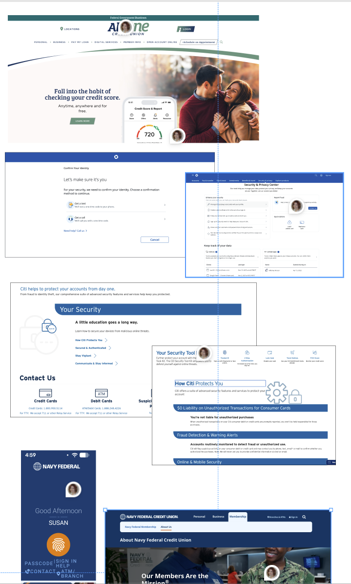
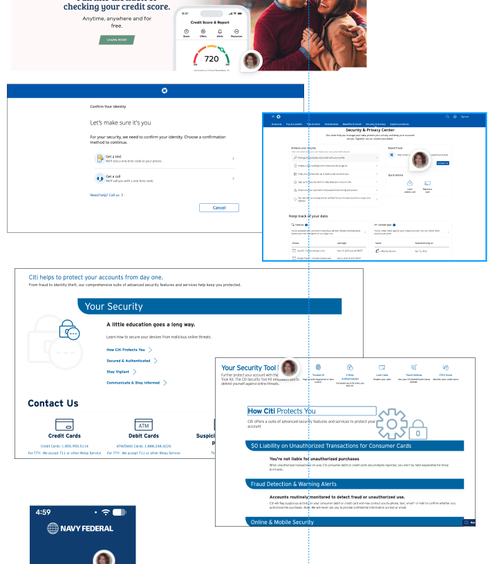
Banking App/Website Redesign
I decided I wanted to learn both UX and UI Design. This project was for my Professional Certificate in UI Design. We were asked to create a fictional banking application for both desktop and mobile devices. This case study shows the project and how I came to a final product.
Role
Lead UI Designer
Timeline
Design Tools
Problem statement
This assignment is for a fictitious bank looking to build a new interface that would break them into the banking industry. This product should differentiate them from other financial institutions already established in the market.
Nov 2025 - Feb 2026
Figma
Illustrator
Banking App UI Design
Hotel Booking UX Website Design
Brand Values
Clear


A financial institution is a trusted source; information should be presented in a clear and uncluttered way.


Playful
Using a product should bring joy to the user. This bank wants to show personality without being cartoonish by using color and shapes.
The fine balance between playful and trustworthy needs to be met. Users must feel they can trust the product.
Trustworthy
Research
Before we can design, research should be done on the competition and mood boards should be created with examples of good UI Design.
Examples of clear
Examples of playful
Examples of trustworthy
Component references
Typography references
Color references
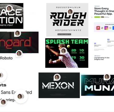
Text References
Objectives
What's in a name....
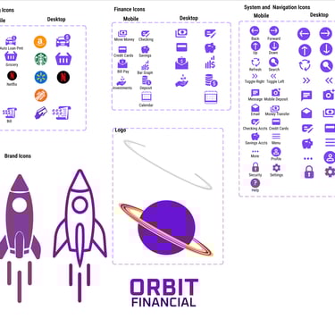
The idea behind Orbit Financial was the blend of trust and playfulness. I did a search on ChatGPT for ideas on "space" names I decided on Orbit. Space to me represents the future and we are all trying to save for the future.
"Growing your savings for the future and beyond"

WHY PURPLE?
During this project I researched colors and reasons behind using them. Purple is a bold color often representing luxury, wisdom, and forward-thinking.
This was the perfect choice for a bank looking to stand out from the competition, while also representing a brand for a forward-thinking financial institution.
THAT BRINGS US TO COLOR PALETTE
The name ORBIT FINANCIAL lends itself to being futuristic, modern, this lead to the purple. I needed to find a palette that would work with such a bold color, so I turned to coolors.co to generate combinations that complemented one another. Originally I thought I could keep the palette to 3 or 4 colors but it turned out I needed a few more.
#6816D2
Primary Purple
Secondary
#2D0A5C
Neutral
#C4B1DD
Neutral
CTA Color
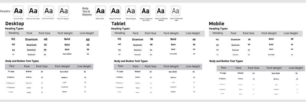
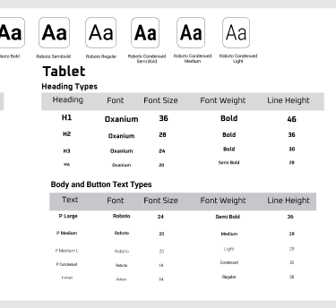
ORBIT FINANCIAL represents a forward-looking vision, so the typography was intentionally selected to convey a modern, futuristic, and bold aesthetic. Font pairings were carefully evaluated using fontpair.co to ensure visual harmony and effectiveness across all applications.
The primary brand typeface, Oxanium, is used for headings and within the logo to establish a distinctive and contemporary identity. Due to its more decorative nature, it is reserved for high-impact elements rather than detailed financial content.
For body text and essential information, Roboto was selected for its clarity, readability, and versatility—ensuring that all financial communications remain accessible and easy to understand.
Typography & iconography
Iconography was created in a combination of Figma Iconify Plugins and drawings. I ended up ditching the store spending icons because they were just too distracting. I also decided that the icons were too bold and went with a line art version to keep it lighter.
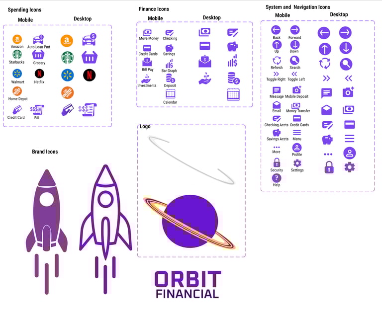
Neutral
#f5f5fa
#87bba2
#ffc833
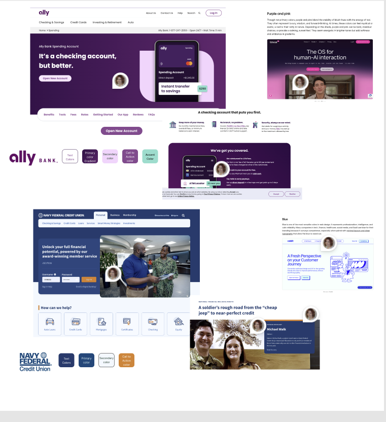
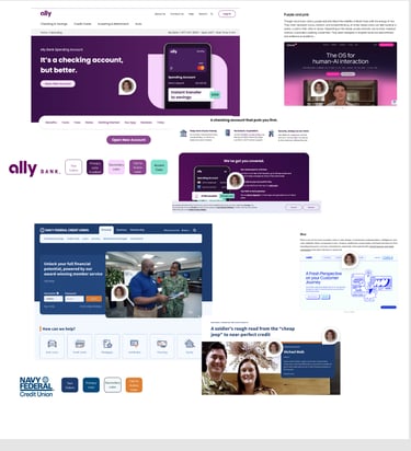
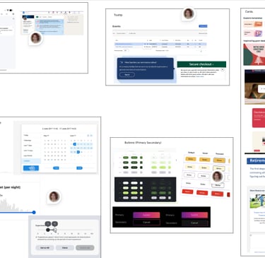
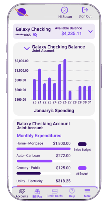
The Design
The assignment was to create three screens for desktop, tablet and mobile:
My accounts
Current accounts
My Spending
I did end up doing a few iterations before settling on my final design.
Iteration 1 - no launch
I went way out there with this design, I was thinking too futuristic and i'm glad I decided to user test this before proceeding. I had a few people review the design and give me feedback and it was unanimous that it was way too busy and confusing. I took a step back and realized it looked more like a game console than a financial website...back to the drawing board.
Iteration 2
Final Design
Iteration 2 was better but still had flaws:
If this is your accounts page, we should clearly give an option to select which account you want to access, the icons on the top of the page don't clearly indicate you can make a selection
The purple blocks to choose accounts was too distracting and your eye gets lost on how you are supposed to process the information
I used the Oxanium font on areas that needed clearer font so I swapped for the Roboto
Offers should be a suggestion, not a bolded feature of the page so I toned down the color to be less distracting
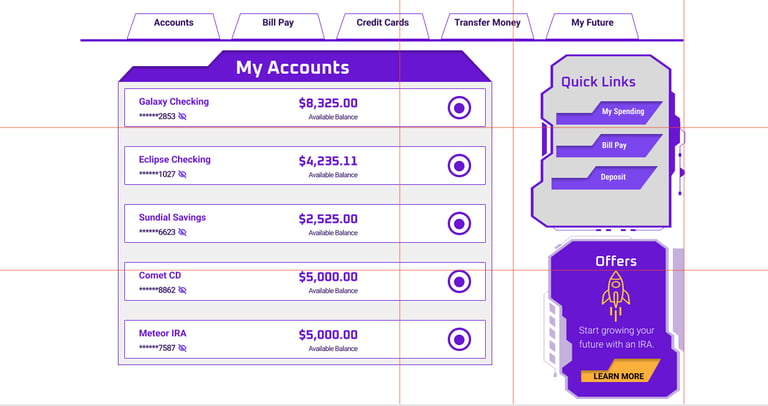
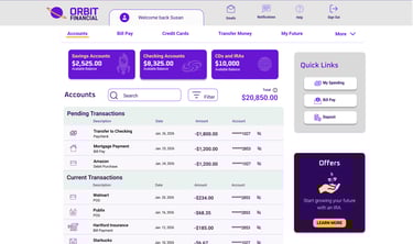
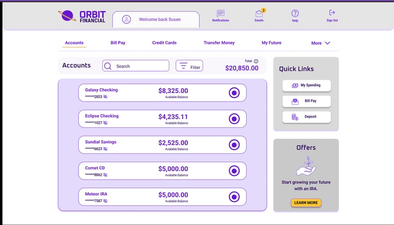
Iteration 3 Final Design
I revamped the accounts page to be just that, the accounts page, where you select which account you want to view.
I used color to draw attention to the account selection buttons with a quick view of the account number and balance
The offers were toned down to be less distracting but kept the call to action button yellow
This page now has more space between each account and is less cluttered
A subtle drop shadow is used on each frame in a purple tone for brand consistency
Edges are rounded for a softer feel
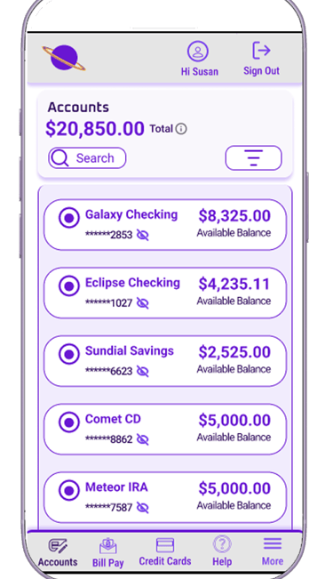
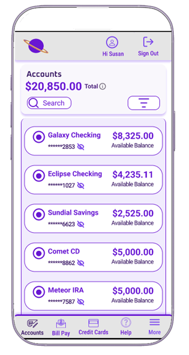
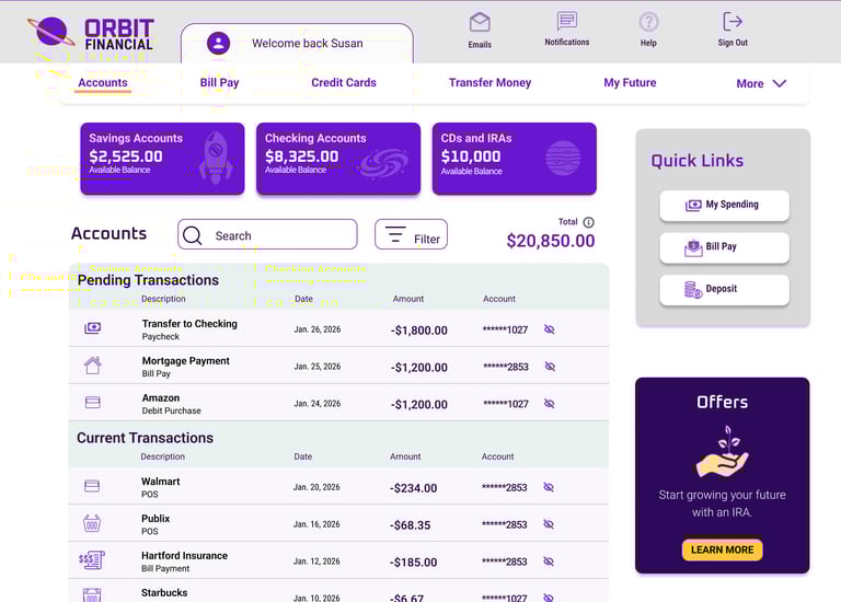
Mobile design is streamlined with limited action buttons on the top of the screen; most action buttons are at thumb level.
Colors are used with ADA in mind. I used Figma's contrast standard checker to make sure font colors were compliant for users with sight disabilities, as well as making sure all graphics had descriptive text
Space is added between accounts to accommodate for button touch
The mobile menu is added to the bottom, and quick links are removed with the offers ad
Lessons Learned
Conclusion
A design is never truly complete—there are always opportunities to refine and improve it based on user feedback and evolving design trends.
I learned that gathering feedback early in the process saves time. Instead of fully designing every screen, I focused on completing just the initial accounts page before seeking input. This approach helped ensure I didn’t invest too much time in a design that users might find unfriendly.


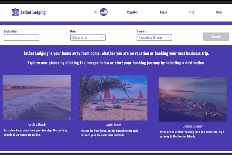
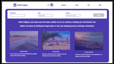
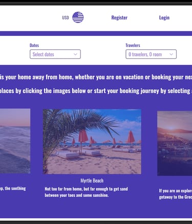
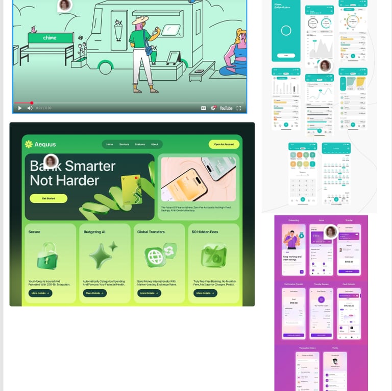
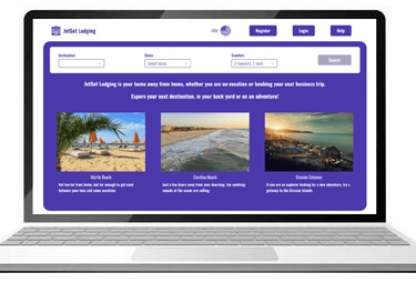
Hotel Booking Website
This assignment is for a fictitious company looking to create a new hotel booking website that would stand out from the competition. I used bright colors and a user flow that is easy to navigate based on usability research and feedback.


Role
Lead UX Designer
Timeline
Design Tools
June 2025 - Oct 2025
Figma
Figjam
Miro
Illustrator
Problem statement
Hotel booking websites often share common features; however, they can also present notable challenges for users. The checkout process is frequently a source of frustration, and in some cases, site navigation can be unclear or unintuitive. Conducting usability studies is an effective way to identify and address issues within the user journey, ultimately improving the overall user experience.
Usability Study
Learning what works and what doesn't.
It all starts with creating a script and giving a scenario for the user to feel comfortable and create a more neutral environment for them.
For the protection of both the user and the company, the user needs to sign a consent form.
Before initiating a usability study, whether it is in person or virtual, provide the user with what is expected and how the session will go.


For this assignment, we were provided with Zoom recordings of two usability tests conducted on competitor websites, and I facilitated a third session via Zoom. During my session, the participant was given a scenario in which they were asked to book a hotel in Las Vegas for two people from November 1 through November 15. The participant was not guided during the session and was only permitted to ask questions if they became stuck.
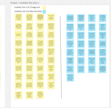
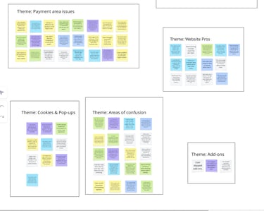
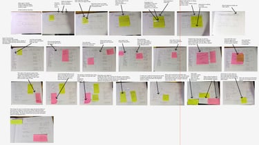
I documented observations in real time and later reviewed the session recording to gain deeper insight into the participant’s experience, including key points of satisfaction and frustration. From the recordings, I took my notes and did card sorting using Miro then created an Affinity Diagram.
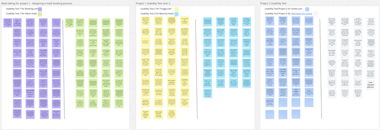

Journey Map and User Flow
This assignment is for a fictitious company looking to create a new hotel booking website that would stand out from the competition. I used bright colors and a user flow that is easy to navigate based on usability research and feedback.
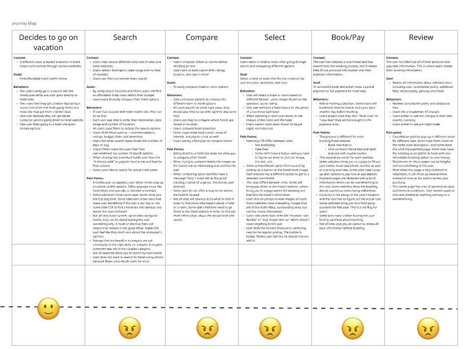
Journey Map
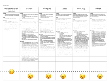
After sorting all of the cards and creating the Affinity Diagram I created a Journey Map. Walking through the 3 user's process I broke the process down into 6 steps. I originally had more but it was too complicated so I simplified. Each step is broken into content, goals, behaviors, and pain points that they had in common.
User Flow
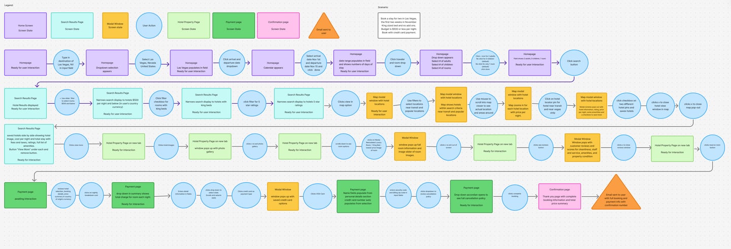
User Flow: Booking a Hotel Stay (Las Vegas Scenario)
This user flow illustrates the end-to-end experience of a traveler booking a hotel stay in Las Vegas for two people over a two-week period, with a focus on usability, filtering, and decision support.
1. Search & Entry Point
The journey begins on the homepage, where the user inputs their destination (“Las Vegas, NV”) and selects travel dates using a calendar picker. They also specify guest details (2 adults, 1 room) before initiating the search.
Goal: Enable quick, intuitive trip setup with minimal friction.
2. Results Exploration & Filtering
After searching, the user lands on a results page displaying available hotels. From here, they refine results using multiple filters:
Price filter (≤ $500 per night)
Room preferences (e.g., king bed)
Star rating (e.g., 5-star hotels)
Each filter progressively narrows the results, helping the user focus on relevant options.
Goal: Reduce cognitive overload by guiding users toward ideal matches.
3. Map-Based Discovery
The user switches to a map view to explore hotel locations geographically. They:
View hotel pricing directly on the map
Filter by proximity to transit and popular attractions
Interact with map pins to preview hotel details
They can save hotels and compare options visually.
Goal: Support spatial decision-making and contextual awareness.
4. Hotel Detail Evaluation
From the results, the user selects a hotel and navigates to the property page. Here they:
Browse photos via a gallery modal
Read reviews and ratings
View amenities and room options
They may open multiple tabs to compare hotels before deciding.
Goal: Build confidence through detailed, transparent information.
5. Room Selection
The user selects a room type (e.g., King Bed, non-smoking) via a modal window that highlights:
Room images
Key features
Pricing breakdown
Goal: Simplify selection with clear, visual comparisons.
6. Checkout & Payment
On the payment page, the user:
Reviews booking details and pricing summary
Enters personal and payment information
Selects a cancellation policy
A credit card modal assists with secure payment entry.
Goal: Ensure a smooth, trustworthy checkout experience.
7. Confirmation & Follow-Up
After completing the booking, the user reaches a confirmation page with:
Booking summary
Total cost
Confirmation number
They also receive a confirmation email with all details.
Goal: Provide reassurance and easy access to booking information.
Key UX Considerations
Progressive filtering reduces overwhelm and improves decision-making.
Map integration enhances usability for location-based choices.
Modals keep users in context while accessing deeper details.
Clear feedback loops (confirmation page + email) reinforce trust.
Outcome
This flow supports a seamless, user-centered booking experience by combining structured navigation, flexible exploration, and clear decision points—ensuring users can confidently move from search to confirmation.
Wire Frames
The rough start to a new site.
It all starts with creating a script and giving a scenario for the user to feel comfortable and create a more neutral environment for them.
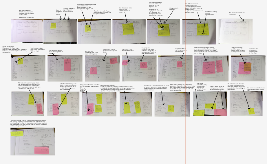
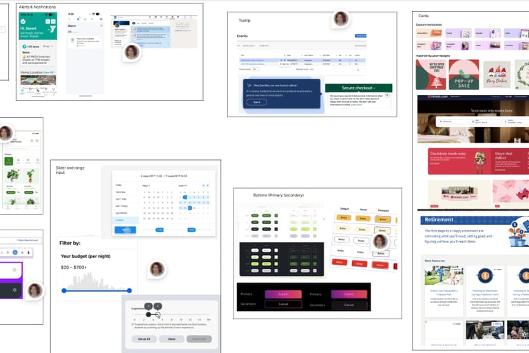
Low-Fidelity Wireframes: Hotel Booking Experience
These wireframes represent the early-stage design exploration for a hotel booking platform. Created using hand-drawn sketches and annotated with user feedback, they focus on validating layout, user behavior, and key decision points before moving into high-fidelity design.
1. Homepage & Search Entry
The initial wireframes explore multiple homepage layouts, all centered around a prominent search bar. Key elements include:
Destination input field
Date selection (check-in/check-out)
Guest and room selection dropdown
Search CTA (call-to-action)
User testing notes highlight the importance of:
Keeping the search function highly visible
Reducing unnecessary text or distractions
Ensuring dropdowns (dates, guests) are intuitive and responsive
Prototype focus: A clean, centered search experience with minimal friction.
2. Search Results Page
The next set of wireframes introduces a structured results layout:
Hotel listings displayed in a vertical scroll
Each listing includes image, price, rating, and key amenities
A filter sidebar for refining results (price, star rating, room type)
User feedback emphasized:
The need for clear pricing visibility
Easy-to-scan hotel cards
Filters that are accessible but not overwhelming
Iteration insight: Early designs were cluttered; later versions simplified the layout and improved hierarchy.
3. Map Integration
Several wireframes explore adding a map view alongside or in place of the list:
Hotel locations pinned with price indicators
Ability to zoom and interact with pins
Option to toggle between list and map views
Testing revealed:
Users value location context when choosing hotels
Map interaction should not interrupt browsing flow
Clear labeling of prices on pins improves decision-making
Prototype focus: A split-view (list + map) or toggle system for flexibility.
4. Hotel Detail Page
The property page wireframes focus on helping users evaluate options:
Image gallery (click to expand)
Hotel description and amenities
Room options with pricing
Reviews and ratings section
User notes highlight:
Strong preference for visual content (photos)
Need for quick comparison between room types
Clear call-to-action for selecting a room
Iteration insight: Adding modals for images and room details improved usability without leaving the page.
5. Room Selection & Modals
Wireframes include modal interactions for:
Viewing room details (bed type, features, price)
Expanding image galleries
Reviewing additional hotel information
These overlays allow users to:
Stay in context while exploring details
Avoid excessive page navigation
Prototype focus: Lightweight modals that enhance—not interrupt—the flow.
6. Checkout & Payment Flow
The checkout wireframes outline a structured, step-by-step process:
Booking summary (dates, guests, price breakdown)
User information form
Payment method selection
Cancellation policy acknowledgment
User feedback identified:
Confusion around pricing breakdown in early versions
Need for transparency in total cost
Importance of trust signals during payment
Iteration insight: Later designs simplify the layout and clearly separate sections.
7. Confirmation Experience
The final wireframe shows a confirmation page:
Booking details summary
Confirmation number
Follow-up email notification
This step ensures users feel confident their booking is complete.
Key Design Themes Across Wireframes
Progressive Disclosure: Information is revealed as needed (filters, modals, details)
User Control: Multiple ways to explore (list vs. map, filters, comparison)
Clarity & Simplicity: Iterations reduce clutter and improve hierarchy
Feedback-Driven Design: Sticky notes capture real usability insights that informed changes
From Wireframes to Prototype
These wireframes directly informed the interactive prototype by:
Defining core user flows (search → filter → explore → book)
Establishing layout structure and navigation patterns
Identifying usability issues early through testing
End Result - High Fidelity Prototype
Click the image above to try the high-fidelity prototype
I designed a high-fidelity prototype for a hotel booking experience that streamlines the journey from search to confirmation while addressing key usability challenges identified during early testing. Starting with a simplified homepage, users can quickly enter their destination, dates, and guest details before exploring a clean, scannable results page. Filters and a map view work together to help users narrow options based on price, rating, and location, while detailed hotel pages with image galleries, amenities, and room comparisons support confident decision-making without disrupting the flow.
The experience culminates in a transparent and intuitive checkout process, where users can easily review their booking details, understand total costs, and complete payment with confidence. Thoughtful interaction design—such as modal overlays, clear visual hierarchy, and persistent summaries—reduces friction at each step. Several iterative design cycles were informed by user feedback, with refinements made throughout to improve clarity, navigation, and overall usability.
The final prototype not only delivers a polished, end-to-end booking flow but also demonstrates how iterative design and user feedback can transform a complex process into a seamless, user-centered experience.